

The digital wallet space is no longer just about storing cards—it is about delivering frictionless, intelligent access to financial and identity tools. With its latest redesign, Google Wallet signals a significant shift in how users interact with their everyday essentials. This update, now rolling out with version 26.14, is more than a cosmetic refresh. It reflects a deeper strategic intent by Google to streamline user experience, reduce interaction friction, and prioritize contextual relevance.
In an ecosystem where speed and accessibility define user satisfaction, even small interface changes can reshape engagement patterns. This redesign attempts to address long-standing usability issues while aligning the app with modern UI expectations.
The Evolution of Digital Wallet Interfaces
Digital wallets have evolved rapidly over the past decade. Initially serving as simple repositories for payment cards, they have expanded into comprehensive platforms housing boarding passes, event tickets, loyalty programs, transit cards, and even digital IDs.
However, as functionality expanded, complexity increased. Users often found themselves scrolling through long lists of passes, struggling to locate frequently used items. This created a paradox where increased utility led to decreased usability.
The redesign of Google Wallet directly addresses this issue by introducing a more structured and prioritized interface.
A New Home Screen Philosophy: From Linear to Grid
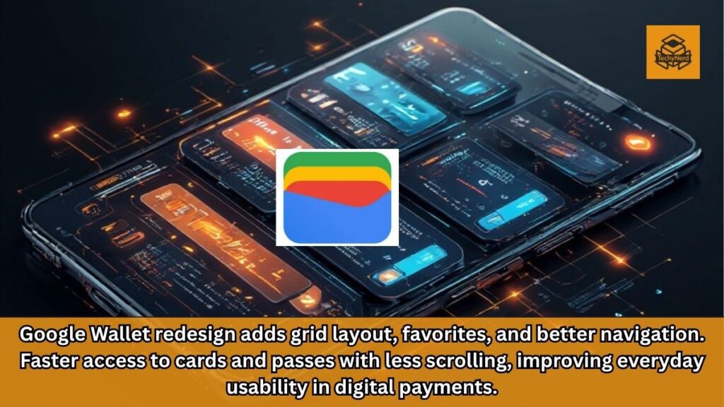
One of the most noticeable changes in the updated Google Wallet is the shift from a linear list to a grid-based home screen layout. This transition represents a fundamental change in how information is organized and consumed.
The grid layout allows multiple cards and passes to be visible simultaneously, reducing the need for vertical scrolling. From a UX standpoint, this aligns with cognitive load optimization principles, where users can process visual clusters more efficiently than sequential lists.
More importantly, the grid emphasizes frequently used items, ensuring that high-priority passes are always within reach. This is a clear move toward predictive and behavior-driven interface design.
Favorites System: Prioritizing What Matters Most
At the core of the redesign lies the introduction of a refined favorites system. Users can now mark passes with a star icon, effectively elevating them to the home screen.
This feature is not entirely new in concept, but its implementation within Google Wallet is noteworthy. It introduces a layer of personalization that was previously lacking.
However, the current process of adding favorites involves multiple steps, which may initially hinder adoption. From an industry perspective, this suggests that Google is still iterating on the balance between control and simplicity.
Despite this minor friction, the favorites system significantly improves accessibility for frequently used items such as transit passes or payment cards.
Reduced Friction Through Smarter Navigation
The redesign introduces a “View More” button at the bottom of the home screen, acting as a gateway to a comprehensive list of passes. This secondary interface includes search functionality and sorting options, allowing users to organize passes alphabetically or by recency.
This layered navigation approach reflects a broader trend in app design: separating primary actions from secondary ones. By doing so, the app maintains a clean interface while still offering depth when needed.
Additionally, the inclusion of a dedicated “Manage passes on home” section provides users with granular control over their home screen layout. This empowers users to curate their experience rather than relying solely on algorithmic prioritization.
Card and Pass Redesign: Visual and Functional Enhancements
Beyond the home screen, Google has also refreshed the design of individual cards and passes. While these changes may appear subtle, they contribute to a more cohesive and modern visual identity.
Improved spacing, clearer typography, and better visual hierarchy enhance readability and usability. These refinements are particularly important in scenarios where users need to access information quickly, such as at airport gates or transit checkpoints.
From a design systems perspective, this update aligns Google Wallet more closely with Material Design principles, ensuring consistency across the Android ecosystem.
The Role of Personalization in Fintech Apps
Personalization is becoming a defining factor in fintech applications. Users expect their apps to adapt to their habits and preferences rather than forcing them into rigid workflows.
The updated Google Wallet embraces this trend by allowing users to prioritize passes manually. While this is a step in the right direction, it also opens the door for future enhancements such as AI-driven recommendations.
For example, the app could eventually surface boarding passes automatically on travel days or highlight payment cards based on location. Such features would further reduce friction and enhance user satisfaction.
Competitive Landscape: Where Google Wallet Stands
The digital wallet market is highly competitive, with major players continuously refining their offerings. Apple Wallet, Samsung Wallet, and various banking apps all compete for user attention.
In this context, Google Wallet’s redesign is both necessary and strategic. By focusing on usability improvements, Google aims to strengthen its position in the Android ecosystem.
However, the success of this update will depend on execution. Features like the favorites system must be intuitive enough to encourage widespread adoption.
Usability Trade-Offs: Simplicity vs Control
One of the recurring challenges in UI design is balancing simplicity with user control. The Google Wallet redesign attempts to address this by offering both a streamlined home screen and detailed management options.
While this approach provides flexibility, it also introduces complexity for less tech-savvy users. The multi-step process for managing favorites is a clear example of this trade-off.
From an expert perspective, the ideal solution would involve a more seamless onboarding experience that guides users through customization without overwhelming them.
The Broader Implications for Android Ecosystem
This redesign is not just about Google Wallet—it reflects broader trends within the Android ecosystem. As Google continues to unify its design language, apps like Wallet serve as testbeds for new UI paradigms.
The emphasis on grid layouts, personalization, and reduced friction is likely to influence other Google apps in the future. This creates a more cohesive user experience across devices and services.
Future Outlook: What Comes Next
The current update lays the foundation for future innovations. As digital wallets become more integrated into daily life, we can expect further enhancements in areas such as security, AI-driven insights, and cross-platform compatibility.
Google’s investment in Wallet suggests that it views the app as a central hub for digital identity and financial interactions. This positions it as a key component of the company’s long-term strategy.
Final Analysis: Incremental Change with Strategic Impact
The Google Wallet redesign may not appear revolutionary at first glance, but its impact lies in the details. By addressing usability pain points and introducing personalization features, Google has taken a meaningful step forward.
However, there is still room for improvement. Simplifying the favorites system and enhancing automation could elevate the experience further.
In its current form, the update represents a solid evolution rather than a complete transformation. It improves day-to-day usability while setting the stage for future advancements.
FAQs
1. What is new in the Google Wallet redesign?
The update introduces a grid layout, favorites system, improved navigation, and redesigned cards and passes.
2. How does the favorites feature work?
Users can mark passes with a star icon to prioritize them on the home screen.
3. Does the redesign reduce scrolling?
Yes, the grid layout displays more items at once, minimizing the need for scrolling.
4. Can I customize the home screen?
Yes, users can manage and reorder passes through the “Manage passes on home” option.
5. Is the update available to all users?
It is rolling out gradually with version 26.14 of the app.
6. What is the “View More” feature?
It opens a full list of passes with sorting and search options.
7. Are there changes to individual cards?
Yes, cards and passes now feature improved design and readability.
8. Does this affect payment functionality?
No, core payment features remain unchanged.
9. Is the redesign better than before?
It improves usability, though some features like favorites could be more intuitive.
10. What can we expect in future updates?
Potential AI-driven personalization and smarter automation features.