

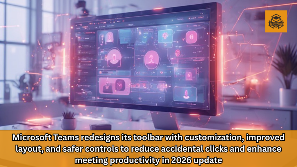
In the modern digital workplace, even the smallest user interface decisions can have outsized consequences. A misplaced click, an accidental button press, or a confusing layout can disrupt workflows, slow productivity, and introduce friction into otherwise seamless collaboration. This is exactly the problem Microsoft is attempting to solve with its latest redesign of Microsoft Teams.
The upcoming update, scheduled for rollout in mid-2026, focuses on rethinking the meeting toolbar, one of the most frequently used components of the Teams interface. At first glance, the change may appear minor, but from a product design and enterprise software perspective, it represents a deeper shift toward adaptive, user-centered interfaces.
The Problem: Accidental Interactions in High-Stakes Meetings
Anyone who has used video conferencing tools extensively understands how disruptive accidental interactions can be. Among these, the unintended activation of the “Raise Hand” feature stands out as one of the most common and awkward issues. In large meetings, a single mistaken click can interrupt the flow of conversation, forcing presenters to pause and address a non-existent query.
This issue highlights a fundamental challenge in user interface design: balancing accessibility with precision. When controls are too easily accessible, they become prone to accidental activation. When they are too hidden, they become difficult to use intentionally. Microsoft’s redesign attempts to strike a better balance between these competing priorities.
Reimagining the Toolbar: Customization at the Core
The most significant change in the new Teams toolbar is the introduction of customization. Users will now have the ability to pin, unpin, and reorder meeting controls according to their preferences. This shift aligns with a broader trend in enterprise software, where personalization is becoming a key differentiator.
From a technical standpoint, enabling this level of customization requires a flexible UI framework that can dynamically adapt to user input. It also introduces challenges related to consistency, as different users may configure their toolbars in entirely different ways. However, the benefits of personalization often outweigh these challenges, particularly in environments where efficiency is critical.
By allowing users to prioritize the controls they use most frequently, Microsoft is effectively reducing cognitive load. Instead of scanning a fixed toolbar for the right button, users can create a layout that matches their workflow.
The Raise Hand Button: A Thoughtful Relocation
One of the most notable changes in the redesign is the relocation of the Raise Hand button. Instead of being prominently displayed alongside other controls, it will now be grouped under the Reactions menu.
This decision is rooted in behavioral analysis. The Raise Hand feature is typically used less frequently than controls like mute, camera toggle, or screen sharing. By placing it within a secondary menu, Microsoft reduces the likelihood of accidental activation while still keeping it accessible when needed.
This approach reflects a common principle in UX design: high-frequency actions should be immediately accessible, while low-frequency actions can be nested within additional layers. The challenge lies in ensuring that these secondary layers remain intuitive and easy to navigate.
Separating the Leave Button: Preventing Costly Mistakes
Another key change is the repositioning of the Leave button. In the new design, it will be clearly separated from other controls, likely positioned on the far right of the toolbar.
This adjustment addresses a different but equally frustrating issue: accidental meeting exits. In professional settings, unintentionally leaving a meeting can be more than just embarrassing; it can disrupt communication and create confusion among participants.
By isolating the Leave button, Microsoft reduces the risk of misclicks while also making the exit action more deliberate. This design choice aligns with safety-focused UX principles, where critical actions are intentionally separated to prevent errors.
Design Philosophy: Familiar Yet Evolving Interfaces
Microsoft has acknowledged that the new toolbar “may feel different at first.” This statement reflects an important reality in software design: even improvements can face resistance if they disrupt established habits.
Users develop muscle memory over time, especially in tools they use daily. Any change to the interface, no matter how beneficial, requires a period of adjustment. The success of this redesign will depend on how quickly users can adapt and whether the new layout delivers measurable improvements in usability.
From a broader perspective, this update demonstrates Microsoft’s willingness to evolve its products based on user feedback. It also highlights the importance of iterative design, where continuous refinement replaces one-time overhauls.
Integration With the Microsoft 365 Ecosystem
The Teams toolbar redesign is not an isolated update. It is part of a larger ecosystem strategy within Microsoft 365. As Teams continues to integrate with other Microsoft services, the need for a streamlined and efficient interface becomes even more critical.
Features like real-time note-taking powered by AI assistants, improved presentation tools, and enhanced collaboration capabilities all rely on a well-designed interface. The toolbar serves as the primary access point for these features, making its optimization essential for overall user experience.
The Competitive Landscape: Teams vs Slack and Beyond
In the highly competitive collaboration software market, Teams faces strong competition from platforms like Slack and others. While feature parity is important, user experience often becomes the deciding factor for enterprise adoption.
By addressing common pain points such as accidental interactions, Microsoft is strengthening Teams’ position in the market. These seemingly small improvements can have a significant impact on user satisfaction and retention, particularly in large organizations where Teams is used extensively.
Rollout Timeline and Platform Availability
According to Microsoft’s roadmap, the redesigned toolbar is expected to roll out in June 2026. The update will initially be available on desktop and macOS platforms, with potential expansion to other platforms in the future.
This phased rollout approach allows Microsoft to gather feedback and make adjustments before a wider release. It also reflects the complexity of deploying updates in enterprise environments, where stability and compatibility are critical considerations.
Industry Implications: The Rise of Adaptive Interfaces
The Teams toolbar redesign is part of a broader trend toward adaptive interfaces in enterprise software. As users demand more flexibility and efficiency, static interfaces are being replaced by dynamic, customizable ones.
This shift has implications beyond Teams. It signals a future where software adapts to the user rather than forcing the user to adapt to the software. In this context, customization becomes not just a feature but a fundamental aspect of design.
User Experience vs Feature Complexity
One of the ongoing challenges in software development is balancing feature richness with usability. As platforms like Teams continue to add new capabilities, the risk of interface clutter increases.
The toolbar redesign can be seen as an attempt to manage this complexity. By allowing users to control which features are visible and how they are arranged, Microsoft is addressing the issue of overcrowded interfaces.
This approach also aligns with the concept of progressive disclosure, where advanced features are available but not immediately visible, reducing overwhelm for new users while preserving functionality for experienced ones.
Conclusion: A Subtle Yet Strategic Evolution
The redesign of the Microsoft Teams meeting toolbar may not introduce groundbreaking new features, but it represents a thoughtful and strategic evolution of the platform. By focusing on usability, customization, and error prevention, Microsoft is addressing real-world challenges faced by millions of users.
In the broader context of enterprise software, this update underscores the importance of user-centered design. As digital collaboration becomes increasingly central to modern work, even small improvements in interface design can lead to significant gains in productivity and user satisfaction.
FAQs
1. What is changing in the Microsoft Teams toolbar
The toolbar will allow customization and reposition key controls for better usability
2. Why is the Raise Hand button being moved
To reduce accidental activation during meetings
3. Can users customize the toolbar
Yes, users can pin, unpin, and reorder controls
4. When will the update be available
The rollout is expected in June 2026
5. Which platforms will receive the update first
Desktop and macOS versions will get it initially
6. What is the benefit of separating the Leave button
It prevents users from accidentally exiting meetings
7. Will the redesign affect meeting performance
No, it focuses on interface usability rather than performance
8. Is this part of Microsoft 365 updates
Yes, it integrates with the broader Microsoft 365 ecosystem
9. How does this compare to Slack
It improves usability, which is a key competitive factor
10. Will users need time to adjust
Yes, the new layout may feel different initially